

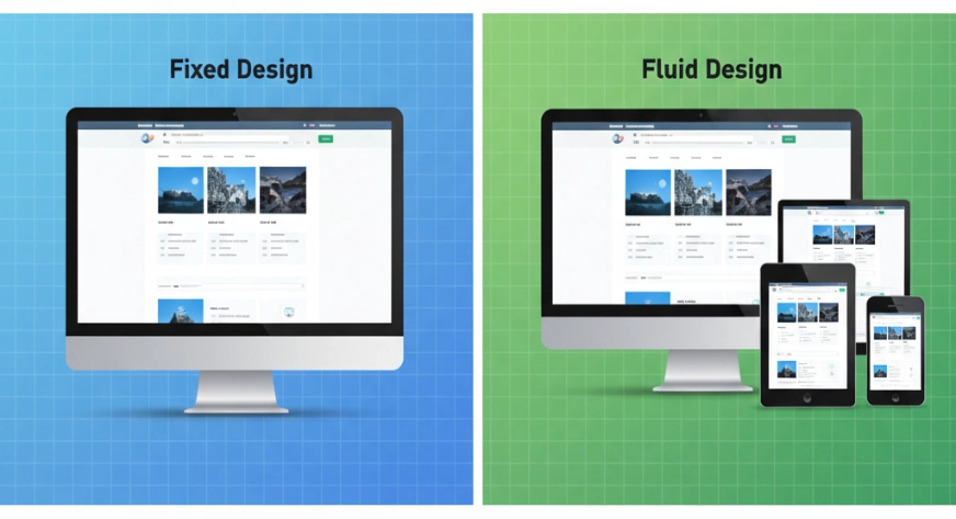
The way people browse the internet today is constantly changing — from huge desktop monitors to tiny smartphone screens, users expect websites to look perfect everywhere. That’s where fluid design comes in.
Fluid design ensures that website elements automatically adjust their size and position to fit any screen, without awkward scroll bars or cut-off images. Unlike fixed layouts, fluid design uses flexible measurements so that your website feels smooth and natural no matter where it’s viewed.
Get ready to find out what is fluid design, why it’s important, how it works, and real examples of it in action.
Understanding Fluid Design
At its core, fluid design is a web design approach where page elements resize proportionally to fit the screen width. Instead of defining everything in fixed pixels, designers use relative units like percentages or viewport widths.
For example, if you design a webpage with a 50% width for the main content section, it will always take up half the screen, whether the screen is 2000 pixels wide or just 320 pixels. This ensures that layouts adapt gracefully without breaking.Think of it like pouring water into different containers. No matter the container’s shape or size, the water adjusts to fill it perfectly. That’s exactly how fluid design behaves with your website’s content.
Why Fluid Design Matters for Websites?
We live in a multi-device world today. A website could be visited from a laptop, tablet, phone, or even a smart TV. Here’s why fluid design matters:
- Better usability: Visitors can easily read and navigate your site without zooming or side-scrolling.
- Device flexibility: The same design works beautifully on all devices, saving you from building separate layouts.
- Modern browsing habits: Users often start browsing on one device and finish on another. Fluid design ensures consistency.
- Accessibility: It supports users with different screen setups, including those who zoom in for larger text.
Big brands like Medium (the blogging platform) and BBC News use fluid layouts so that readers have a consistent experience across all devices.
How Fluid Design is Used in Website Development?

Implementing fluid design in websites involves planning, designing, and coding with flexibility in mind. Here’s the process:
- Planning: Decide which parts of the site need to stretch or shrink.
- Designing: Use flexible grids and relative units during the design phase.
- Coding: Apply CSS units like %, vw (viewport width), and vh (viewport height).
- Frameworks: Use tools like Bootstrap or Tailwind CSS, which make fluid layouts easier to build.
- Testing: Check how the design looks across various devices and screen resolutions.
For example, in an e-commerce store, the product grid might display four items in a row on a desktop, but automatically adjust to two items on a tablet and one item on a phone to all without breaking the layout.
Benefits of Fluid Design
Seamless User Experience Across Devices
With fluid design, your website automatically adjusts to any screen size without breaking layout elements. Whether a visitor is browsing on a large desktop monitor or a small smartphone, the design ensures every element — text, images, menus — remains proportionally aligned and easy to interact with. This eliminates the need for zooming or horizontal scrolling, keeping users engaged for longer.
Future Proof Against New Devices
As new devices with different screen sizes emerge, fixed designs often require rework. Fluid design, on the other hand, adapts naturally to any resolution. This means your site remains accessible and visually appealing even when unexpected screen dimensions become common in the future.
Faster Development For Multiple Platforms
Instead of building separate designs for desktop, tablet, and mobile, a fluid layout lets you create one flexible framework that works everywhere. This reduces both design time and maintenance efforts, freeing up resources for other improvements.
Better Search Engine Performance
Google values mobile-friendliness, and fluid design directly contributes to it. A mobile-friendly website means lower bounce rates, better user engagement metrics, and potentially higher rankings in search results.
Consistent Branding and Visual Appeal
Because fluid design keeps your site’s proportions intact, your brand’s colors, fonts, and layouts remain consistent. This consistency builds trust and helps customers instantly recognize your brand, no matter how they access your site.
Also Read, All about the UGC Content
Implementing Fluid Design Effectively
If you want to use fluid design successfully, here are practical tips that will help you get it right from the start:
1. Start With Mobile First Approach
Design for the smallest screen first, then scale up. This ensures essential features and content remain the focus, and extra space on larger screens can be used creatively.
2. Use Relative Units Instead of Pixels
Apply units like percentages, em, or rem for widths, font sizes, and padding. This allows elements to scale proportionally instead of being stuck at a fixed size.
3. Make Images and Media Flexible
Use CSS rules like max-width: 100% for images so they shrink as needed without distorting. For videos, consider embedding them in responsive containers.
4. Leverage CSS Frameworks Wisely
Frameworks like Bootstrap or Tailwind CSS have built-in responsive grids that simplify creating fluid layouts. However, customize them to your needs instead of relying entirely on defaults.
5. Test Across Multiple Devices and Browsers
Use both real devices and online testing tools to check your design. This helps catch small inconsistencies before they affect real users.
6. Prioritize Performance Along with Design
A beautiful fluid layout won’t matter if it loads slowly. Optimize images, use lightweight CSS, and avoid unnecessary scripts for a smooth experience.
D/w Fluid Design vs. Responsive Design
Many people confuse fluid design with responsive design. While both aim for a great experience across devices, there’s a difference:
- Fluid design changes continuously and proportionally as the screen size changes.
- Responsive design adjusts at specific breakpoints (like when a screen width drops below 768px).
Often, designers use both fluid layouts for smooth resizing, and responsive breakpoints for rearranging elements at certain sizes. For example, a navigation menu might stay horizontal and resize fluidly until the screen gets too narrow, at which point it switches to a vertical hamburger menu.
Final words
Because users switch between devices constantly, fluid design is no longer optional — it’s essential. It ensures that websites adapt smoothly to any screen size, providing a consistent and enjoyable experience for all visitors.
By understanding what is fluid design and combining it with responsive techniques, you can create sites that are visually appealing, user-friendly, and future-ready.
Whether you run a personal blog or a large e-commerce platform, implementing fluid design will keep your site looking sharp and screen friendly everywhere.
Looking to scale your content game faster? Platforms like WebWorks Co. help creators connect with top brands, design UGC videos, and optimize content for real impact. So go ahead—explore, experiment, and take that next step with confidence.


